


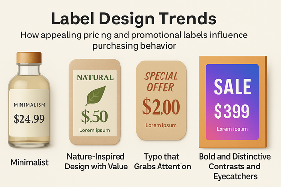
The purchase decision is often made directly in front of the product. Price information and advertising messages on the label are of central importance here. Eye-catching and attractively designed information and advertising labels can significantly promote sales. Companies not only stand out from the competition – customers can also find all the information that is decisive for their purchase at a glance. Both are essential goals of successful packaging design.
A targeted design also supports the branding and strengthens the brand message in the long term. But which design trends are currently dominating the market – and how can companies use them in a targeted manner to make their products stand out?
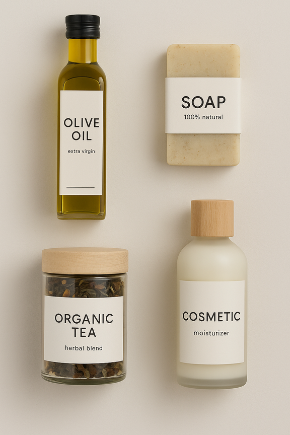
Minimalism is anything but a short-lived trend; it remains one of the strongest design trends. The trend is characterised by clear lines, ample white space, reduced typography, and a limited palette of colours. All this ensures a high-quality, tidy and professional appearance. Natural materials and muted colours convey a timeless elegance, giving brands a calm and harmonious image. The current trend, above all, is the combination of Japanese minimalism and Scandinavian functionality, in which practicality and reduction to the necessary are at the forefront.
This is particularly convincing for premium products. Customers associate minimalist design with transparency and quality, which in turn inspires trust. Ideal for target groups that consume consciously and value quality. Companies use this trend to underline their brand identity in a targeted manner and to make their products appear of higher quality.
Additionally, a tidy label layout facilitates quick information absorption, which is particularly important in retail. Products that are recognised and understood in seconds have a clear competitive advantage. The trend is supported, for example, by transparent viewing windows that utilise partially transparent labels or packaging insights, which in turn strengthen confidence in product quality and emphasise naturalness and authenticity. They are mainly used in food and cosmetic products.
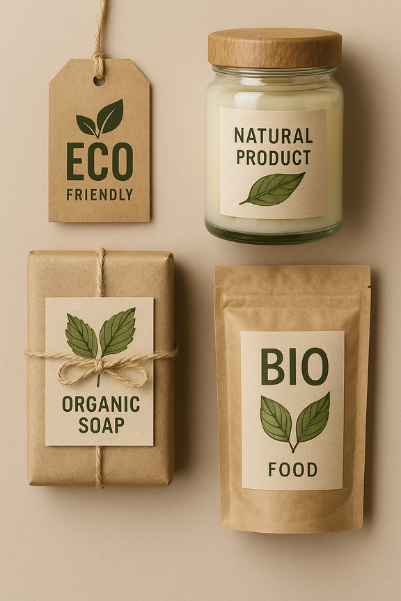
Consumers are increasingly paying attention to sustainable packaging solutions. Promotional labels made from recycled materials or biodegradable alternatives are very popular. A green label can have a positive influence on a purchase decision.
The protection of the environment and resources is a central challenge of our time, and it is also an essential topic for Meto. Therefore, we are continually working to develop sustainable and environmentally friendly solutions. With grass paper labels, we have already introduced a real innovation to our label range, offering a sought-after alternative to conventional paper labels. Their use reduces the consumption of wood, e.g. from rainforests, as well as CO2 emissions by 50 per cent due to short transport routes. Additionally, the natural fibres are biodegradable and 100% recyclable.
Brands that want to emphasise sustainability, in particular, benefit from natural aesthetics. In addition, sustainable printing processes, such as those using environmentally friendly inks or water-based ink, can offer further advantages.
The trend inspired by nature incorporates organic elements, including flowing lines and wood and leaf textures, into the design. Hand-drawn elements also play a role. When it comes to colour choices, you can often find earthy colour palettes complemented by bright accents as well as textures that mimic wood or leaves. This design appeals to environmentally and health-conscious shoppers, strengthening the perception of the brand as sustainable or regional. This is particularly relevant for organic products or natural cosmetics.
A carefully selected font also conveys the brand message. Contemporary companies are increasingly turning to individual and creative typography to stand out from the competition. Eye-catching fonts – such as large, handwritten or playful – set targeted accents and attract attention. In combination with haptic finishes such as embossing or glossy coatings, a strong visual impression is also created. The following principle always applies: Legibility must be guaranteed, even from a greater distance. Especially for price labels, distinctive and easy-to-read fonts ensure unambiguous communication.
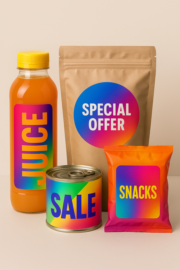
Colourful labels with dynamic colour gradients stand out on the shelf. Advertising labels with bright colours or fluorescent accents can be used specifically to promote impulse purchases. Meto offers information and promotional labels in bright daytime colours that encourage spontaneous purchasing decisions and are proven to increase sales.
Studies show that colours can trigger emotions. For example, red and orange encourage spontaneous purchases, while blue conveys a sense of trust. Companies are specifically focusing on colour combinations to increase their sales figures. Colour psychology is a decisive factor in this. Many brands also develop individual colour schemes to strengthen their recognizability at the same time.
In this context, the trend towards maximum contrasts should also be mentioned, which is bold, non-conformist and colourful. This graphic design trend focuses on the skilful combination of different fonts, weights and sizes with high-contrast colours. Bright colours, unusual colour combinations, colour gradients and neon accents increase visibility on the shelf and trigger attention and curiosity. This positioning makes products appear modern or youthful and is well-suited for trend-driven products, drinks, snacks, and lifestyle items, as well as for tech brands that want to combine innovation and authenticity.
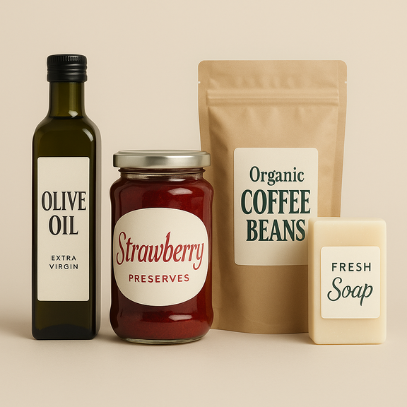
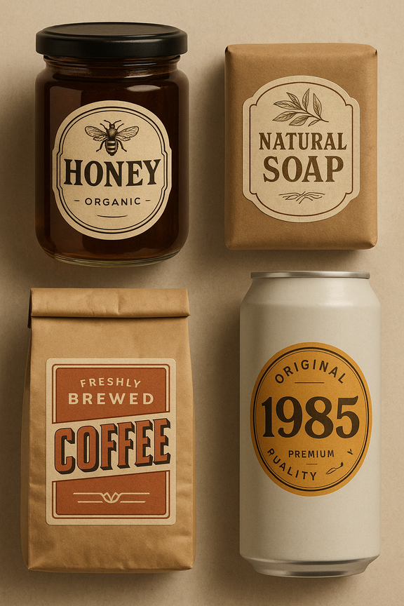
Vintage designs and retro elements are also making a strong comeback in packaging design and promotional labels. They not only give products a striking appearance but also create an emotional bond in a targeted manner.
Vintage design draws on design elements from past decades – such as hand-drawn illustrations, classic typography or a muted, earthy colour palette. It conveys tradition, quality and authenticity. Especially for products with handcrafted or sustainable claims, this style strengthens the confidence of the buyers.
Retro designs utilise elements of pop culture from the 1970s, 1980s, or 1990s, focusing on high recognition value. Eye-catching colours, geometric shapes, and striking typography attract attention on the shelf, awakening childhood and adolescent memories that can positively influence the purchase decision.
Both trends tie in with the longing for "the good old days", arouse nostalgia and trust, and create an emotional bridge between product and consumer. Used correctly, they turn packaging into small worlds of experience with storytelling potential. Such a design embodies consistency, quality, and tradition.
Modern advertising labels are increasingly relying on digital elements. QR codes or NFC tags link the physical product to online content, providing customers with additional information or exclusive offers.
For example, a QR code can lead directly to a discount coupon or provide additional product information. This technology can also be used to inform consumers about sustainable production processes or corporate social values or to connect them to social media channels and thus build emotional customer loyalty. In this way, these digital elements enable direct communication with the brand, make the product tangible, practice storytelling and provide information on origin and production. Additionally, this type of label design and use supports cross-channel marketing and encourages repeat purchases. It also promotes impulse purchases through authenticity and approachability. This approach is particularly suitable for manufacturing, craft, and premium products and is especially interesting for tech-savvy and younger target groups.
If you consider current trends in label design, you can secure a competitive advantage and positively enhance your brand perception in the long term. Brands can use their labels strategically to attract attention and influence purchasing decisions while also bringing the product and brand to life. Advertising and price labels are, therefore, not only functional directly at the POS but also an essential part of branding.